Driving growth for Distribution Publication's product sales.
Distribution-Publications, Inc. (DPI) was established in 1975; DPI provides expert guidance on U.S. Federal Maritime Commission compliance.
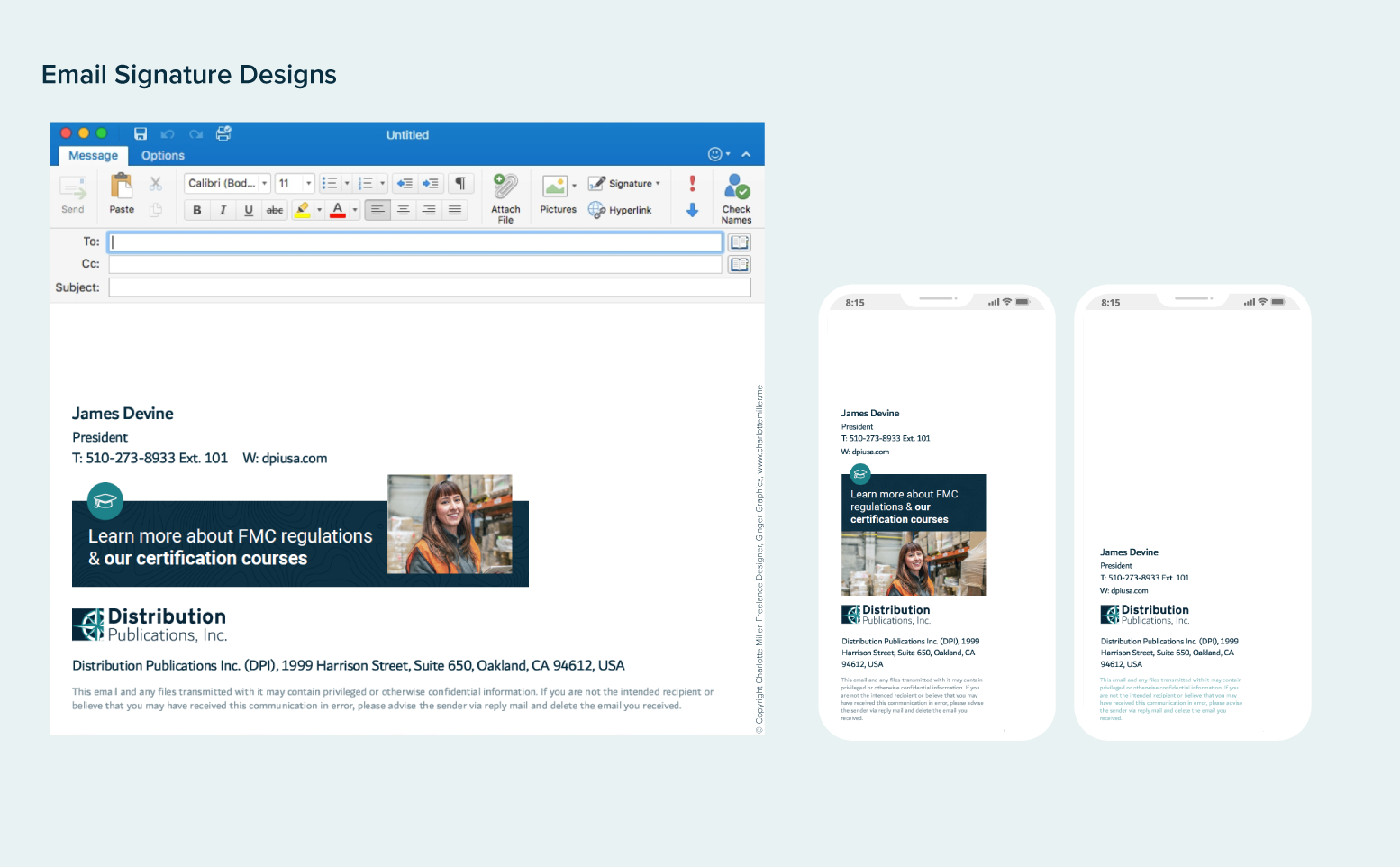
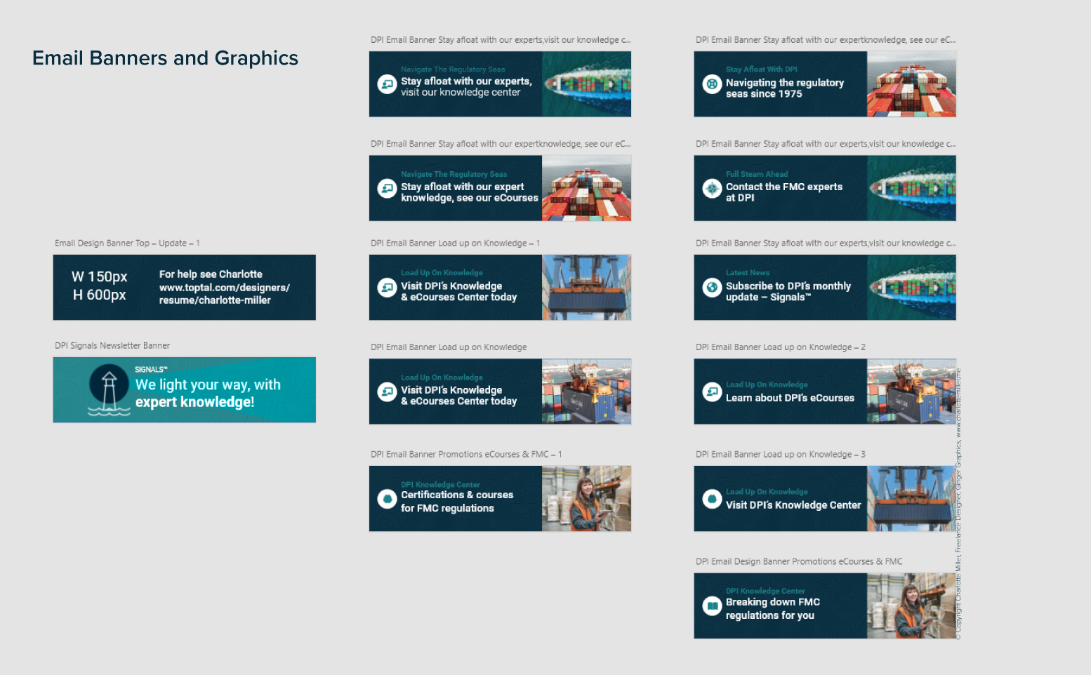
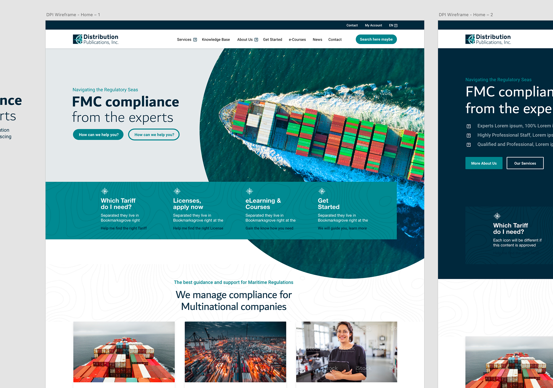
They came to me needing a complete overhaul of their website, marketing materials and software user interface. It was a huge project but one I thoroughly enjoyed completing and was able to bring measurable success. Here are some design highlights from the website, and offline and online marketing materials created with the DPI marketing team.
"30% increase in sales of one of our main products."
"We believe sales were driven primarily by the new website as we don’t advertise and the service page for this product is one of the most viewed on our site since launching."
Nora Devine, Vice President at Distribution Publications, Inc., San Francisco, CA
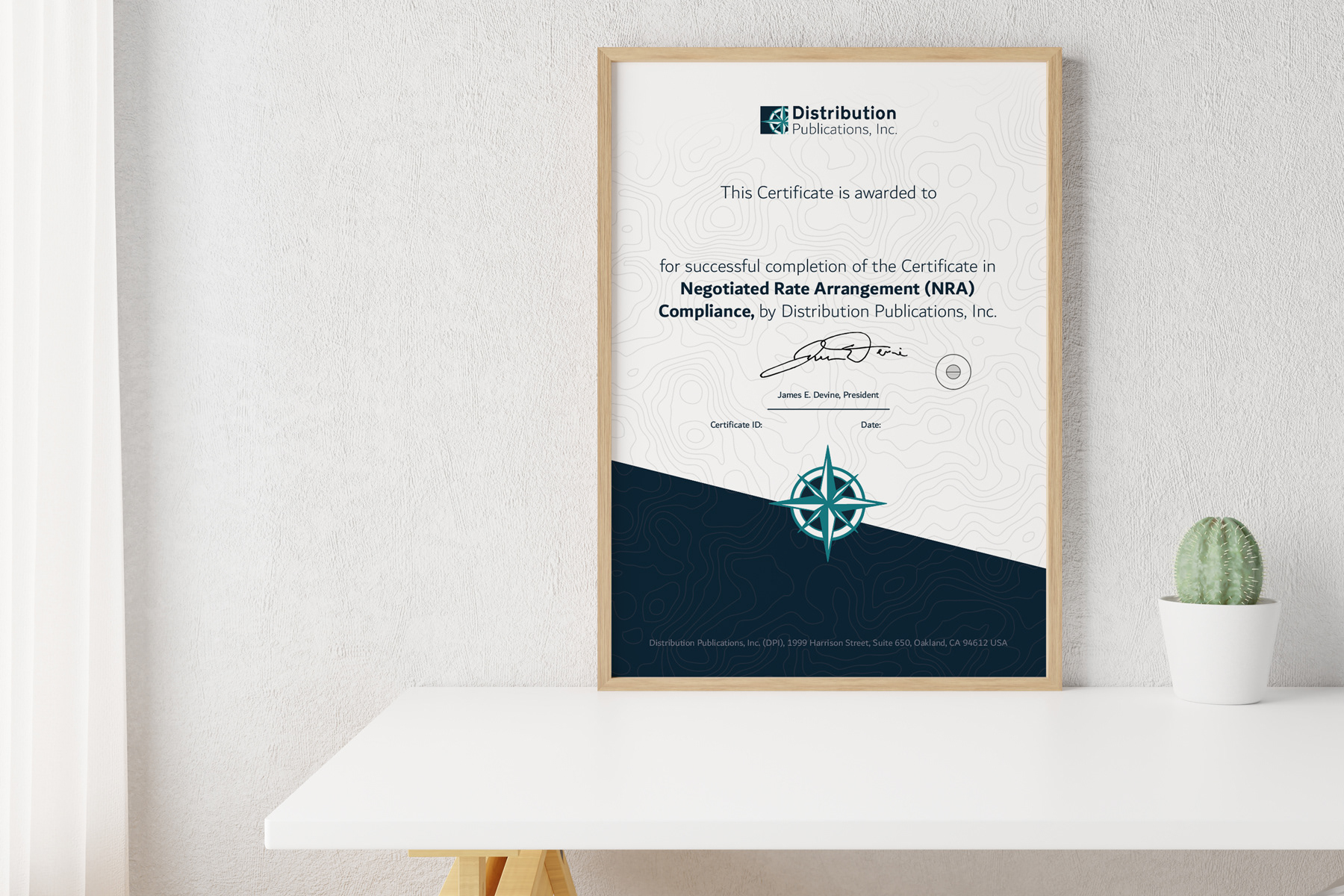
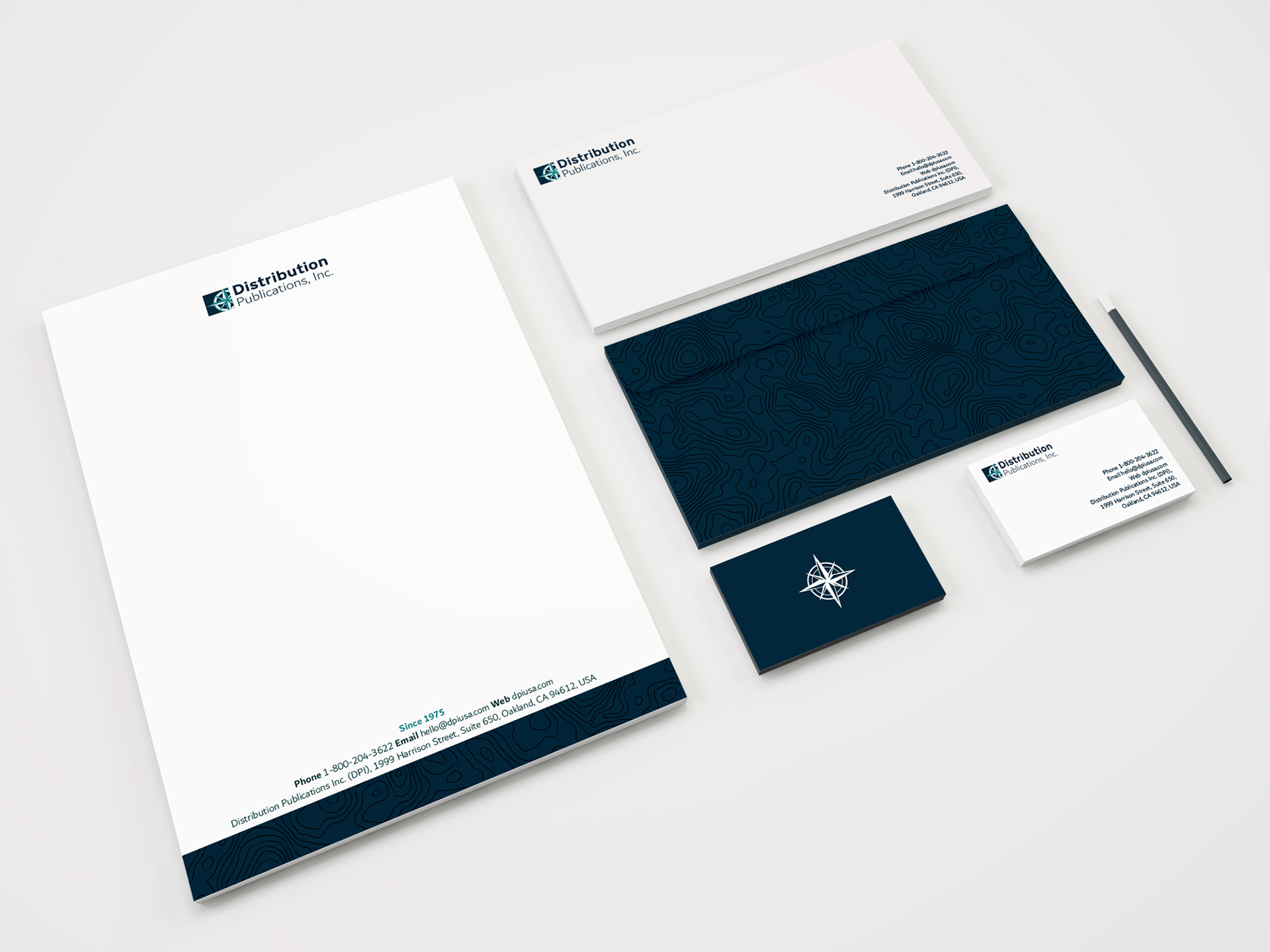
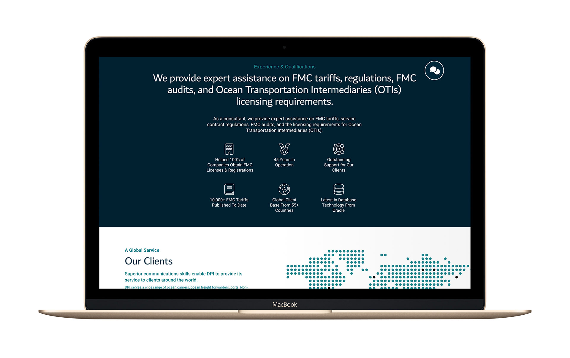
The brand design I created with the topography illustration can easily be adapted across all the different collateral the client needs. Here is a demonstration of one of their certificates for their training courses (see the photo of the framed certificate design above left).
"250% increase in the use of our web contact form."
Nora Devine, Vice President at Distribution Publications, Inc., San Francisco, CA
The process:
Below are 6 snapshots from the process for the website user interface design.
1-2. Design Brief
Before we start the design project I ensure I have all the important information. This ensures I will create what the client needs and then I can make any needed recommendations early on in the process. This is exactly what I did when working with DPI.
Here are a few of the questions we went through when I was preparing the design brief or specification:
A). Why do you need this new project?
B). What are you trying to achieve?
C). Who do you want this project to appeal to?
D). What is your deadline?
E). Do you have any existing designs or collateral? Brand guidelines?
F). Describe your target audience.
G). Do you have a fixed budget? This will dictate the level of finishing like print materials for example and if it's a website how much bespoke software can be built into the site. Or what type of photos we can use I.e stock over photo shot?
3. Research
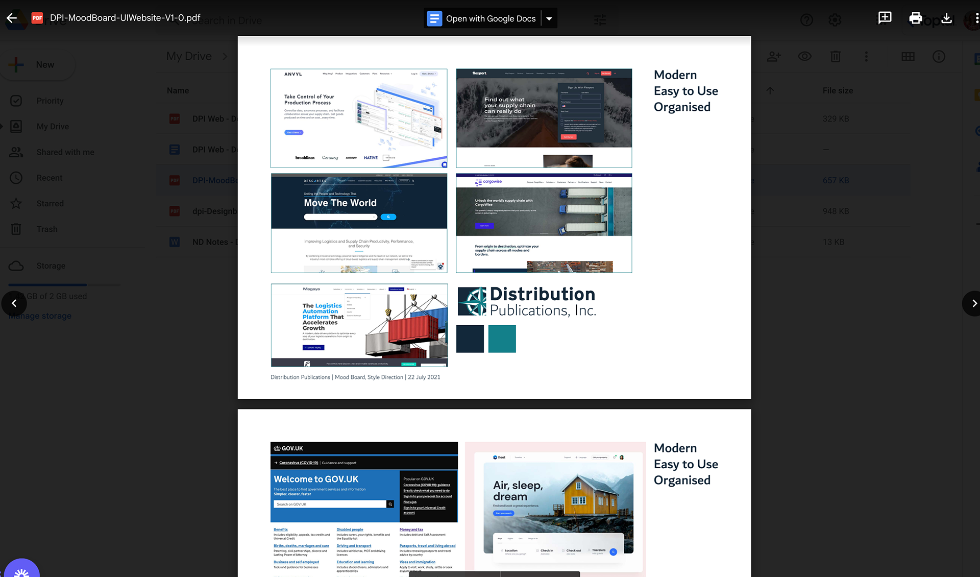
Mood boards and defining the style
Competitor Research
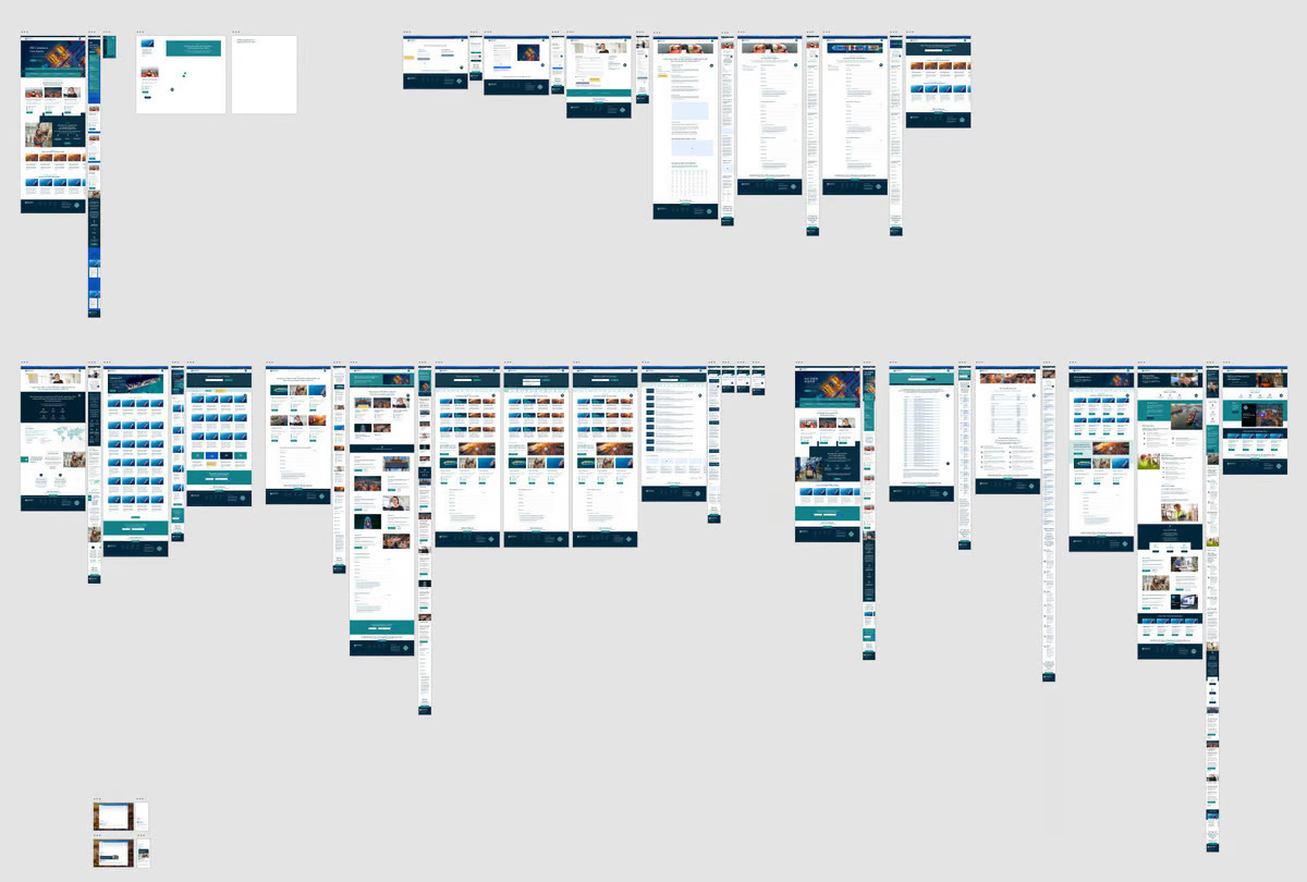
4. Wireframing
What is wireframing? Wireframe is a stage that helps you think about structure, functionality and the content of the site without getting side-tracked by how it should look. This means you can focus on the function of the site and make it easy to use before adding all the design elements like graphics, colour and fancy fonts.
5. Initial prototypes
Bring together the style ideas, research and wireframes
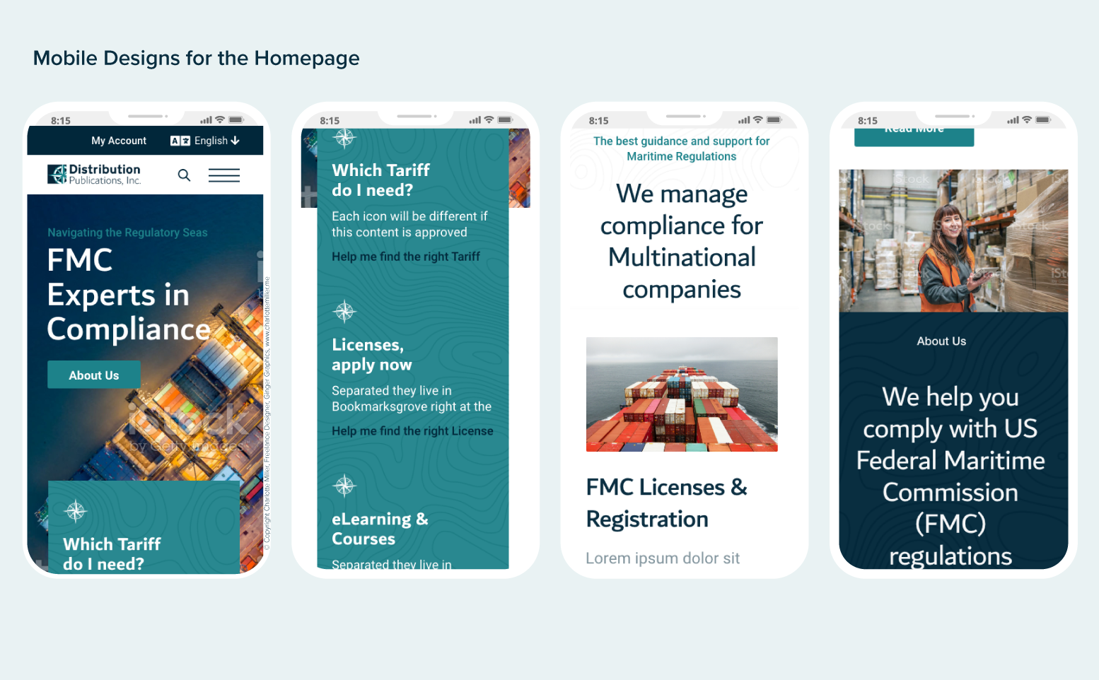
Mobile First
6. High Fidelity Designs
A screenshot of the designs in Adobe XD.


Print marketing assets created
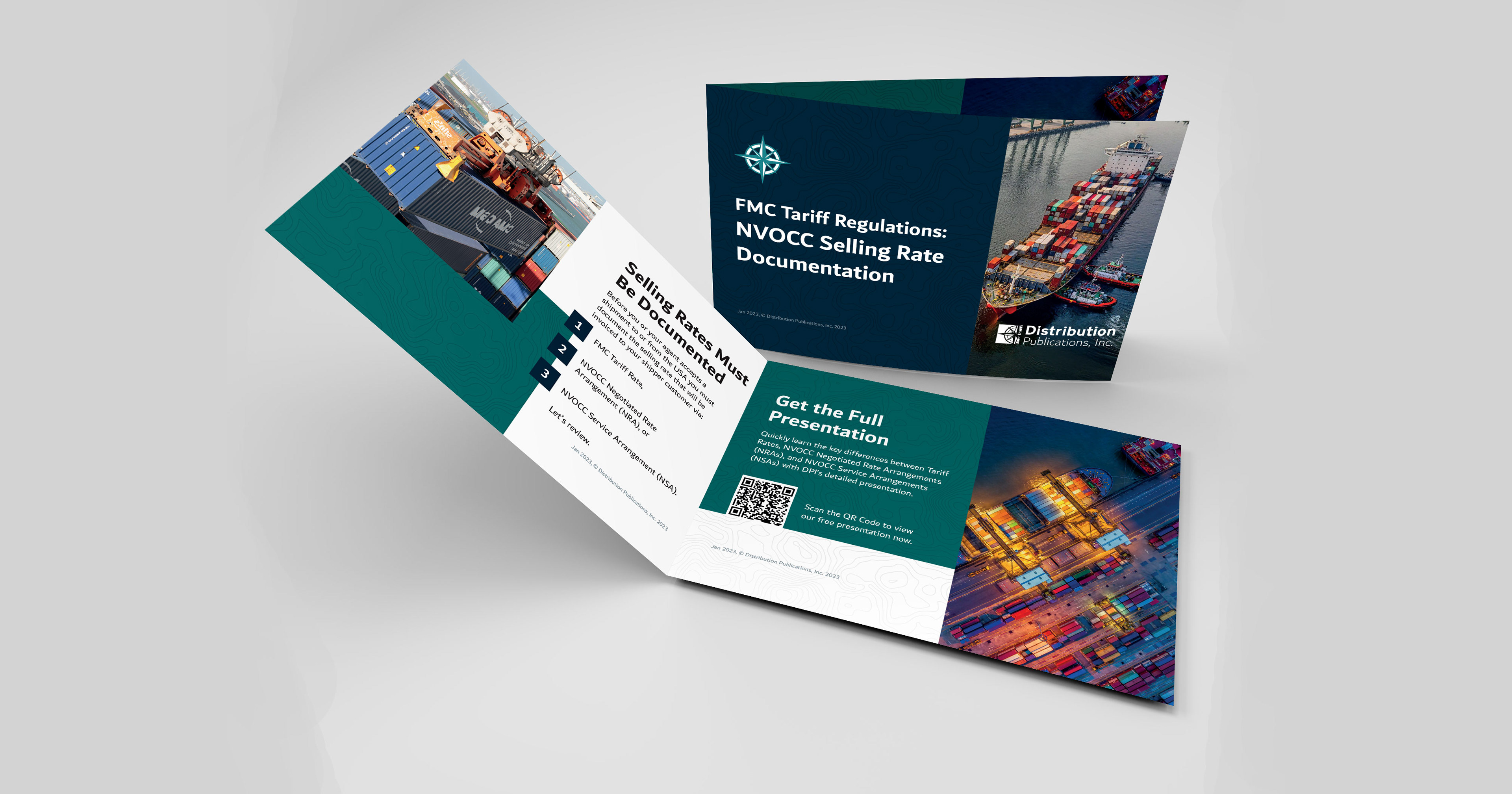
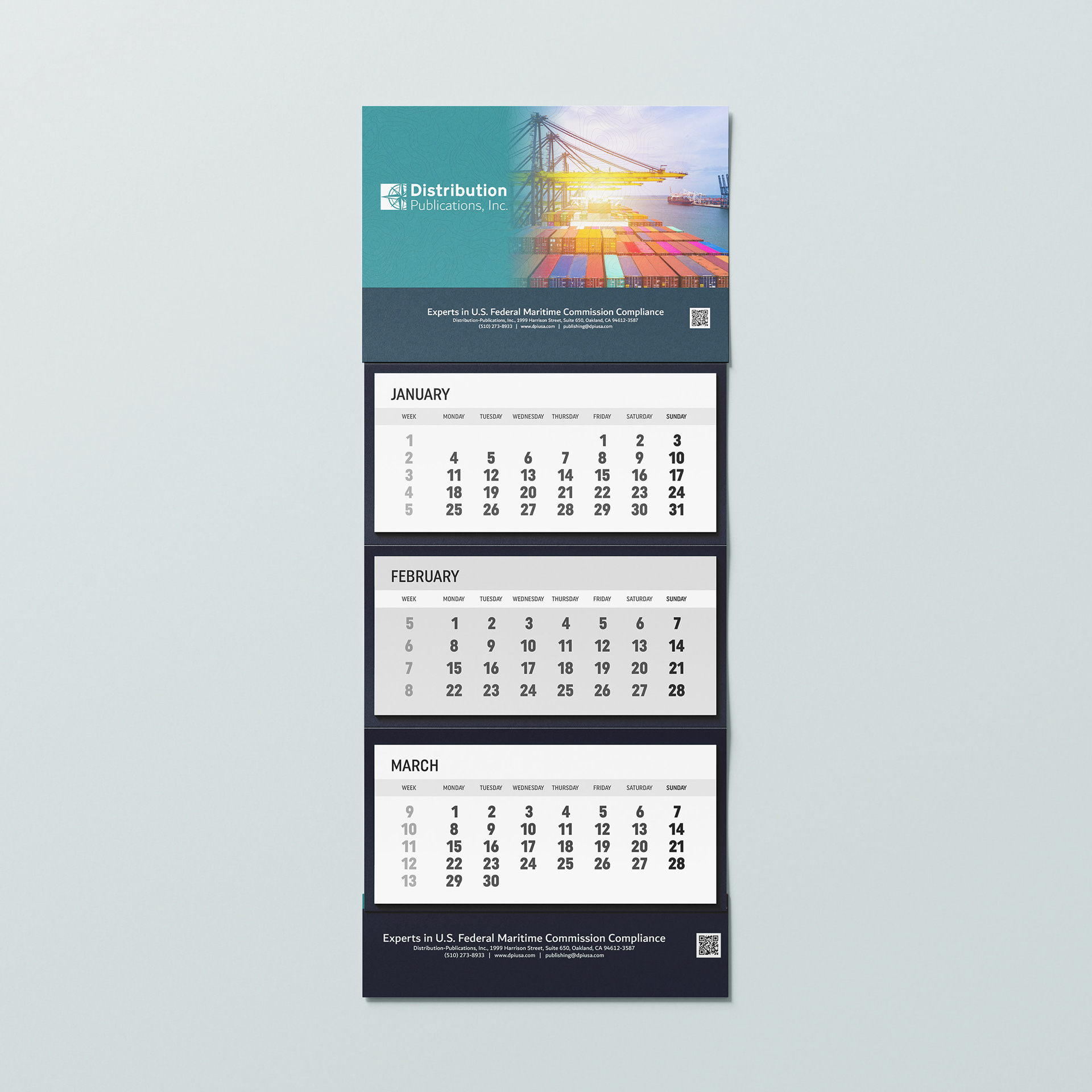
As part of the branding project, the following were also designed:
- A sales leaflet with a link to a presentation
- Stationery and quote paper
- A series of calendar designs
- The award certificate for the courses


Full preview of the site design
Below is a full Desktop preview of one of the video tutorial landing pages. Check out the full redesign here: https://dpiusa.com/
Technologies: UI Design, Responsive UI, Adobe CC, Adobe Experience Design (XD), Digital Design, Desktop Web Design, Forms, Mobile Mockups, Print Design, Layout Design, UI Prototyping, User Testing, Email Design, User-centered Design (UCD), Design Leadership, Web UX Design, Mobile UX Design, Maps, Brand Architecture, Brand Guidelines, Professional Services, UX Prototyping, Booklet Design, Digital Publishing, Newsletter Design, Newsletters, Advertising
