Logo Design and Branding for Gen One. A Construction Company
I also created guidelines so the client knew how to use the logo in a variety of situations.
Brand Guidelines. These contained instructions on how to use the logo, typography, colour and brand elements. This would give the client clear instructions on When to use the secondary logo, right throught to which font to use where.
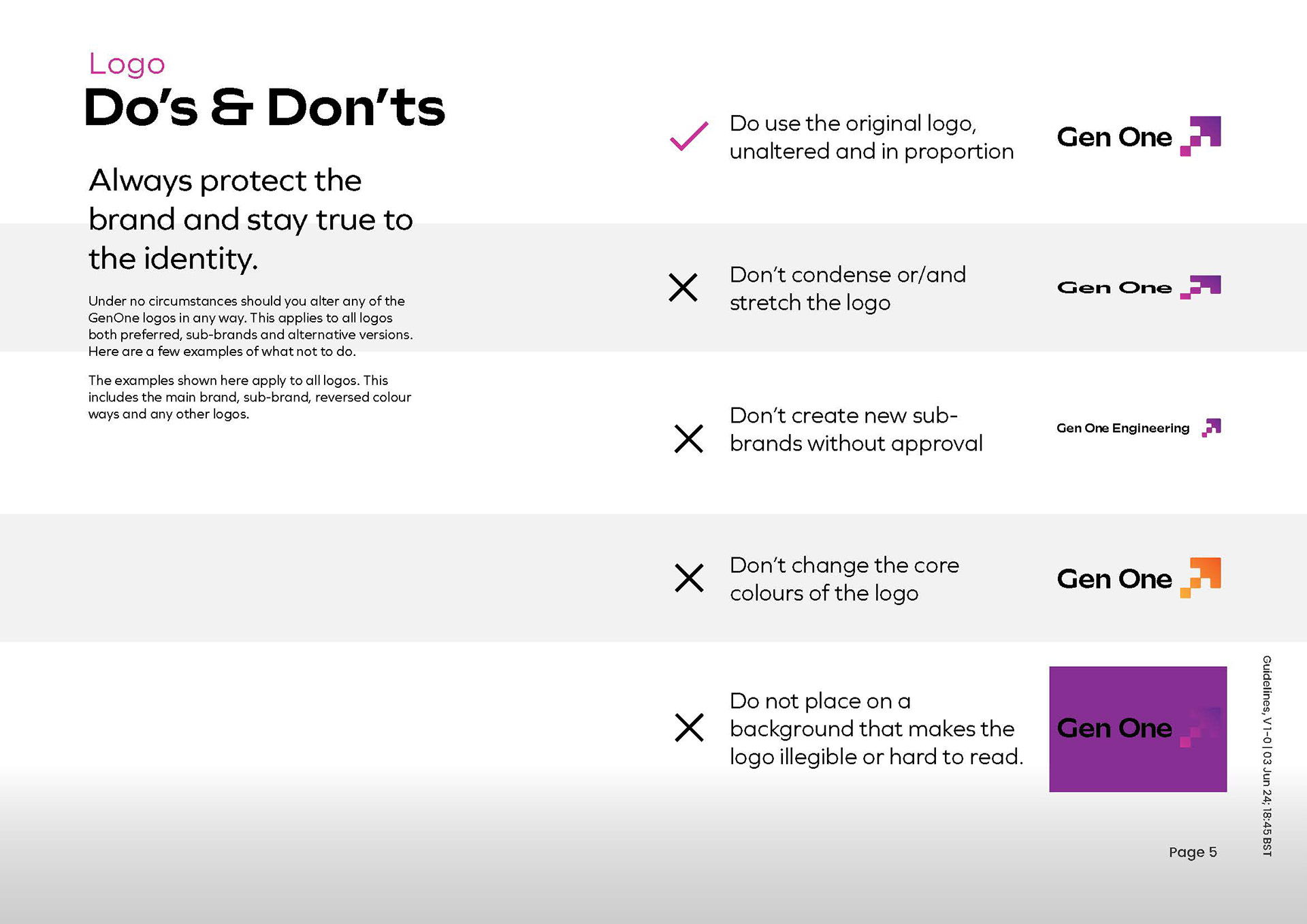
Loog, Do's and don'ts.
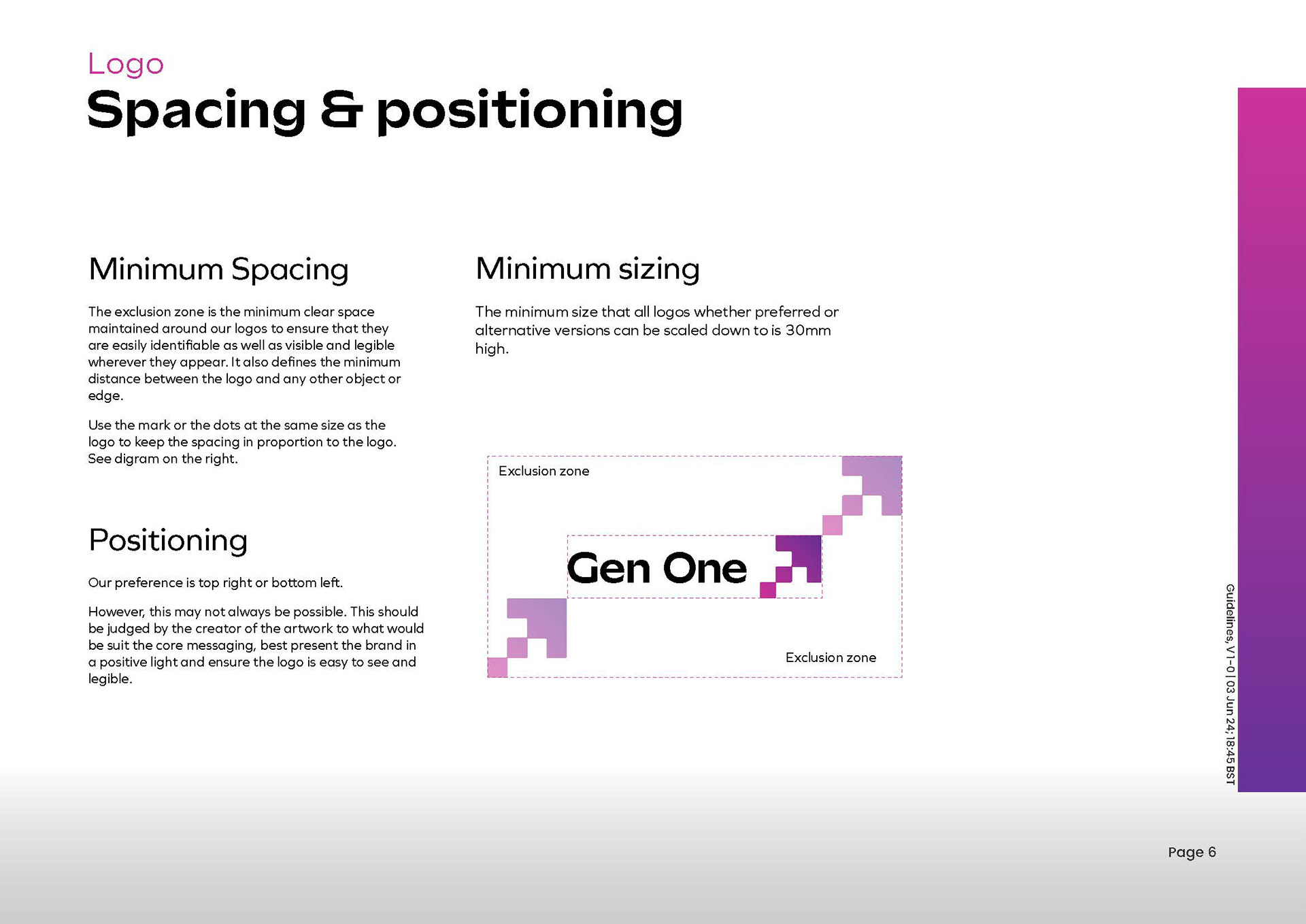
Spacing and positioning.
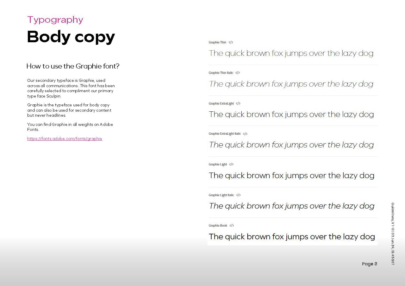
Typography and fonts, body copy or paragraph styles.
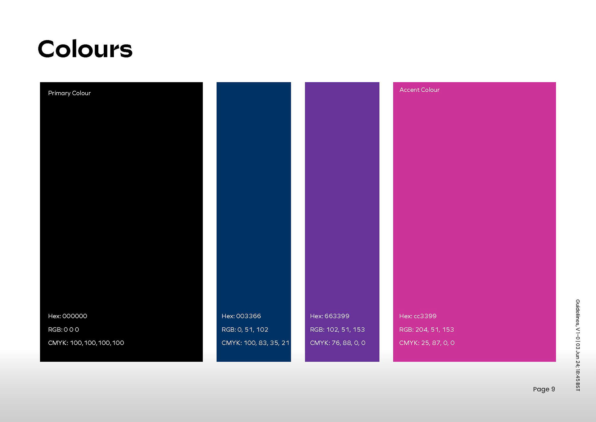
Colours and the Hex codes.

Sub brand and how to use, Gen One Construction.
Brand Guidelines
These contained instructions on how to use the logo, typography, colour and brand elements. This would give the client clear instructions on When to use the secondary logo, right through to which font to use where.
Livery
This project was designed white label for By The Scruff.
